Power BI · SQL Server · Industrial Analytics
I built this report to bring oxygen production, electricity consumption and equipment status into one place. Previously, readings were collected manually twice a day and recorded in Excel. The report provided a more detailed view of how the station was operating and how individual modules performed over time.
From process readings to a usable report
The data came from two sources: process readings collected from PLCs through OPC and MES, and a separate electricity metering system. I used SQL Server to prepare and combine these readings for Power BI.
This involved turning cumulative oxygen counters into hourly production volumes, converting litres to cubic metres, and aligning production with electricity consumption. Daily figures followed the plant’s production schedule, with the reporting day ending at 19:00. The original report refreshed every 20 minutes.
What the dashboard shows
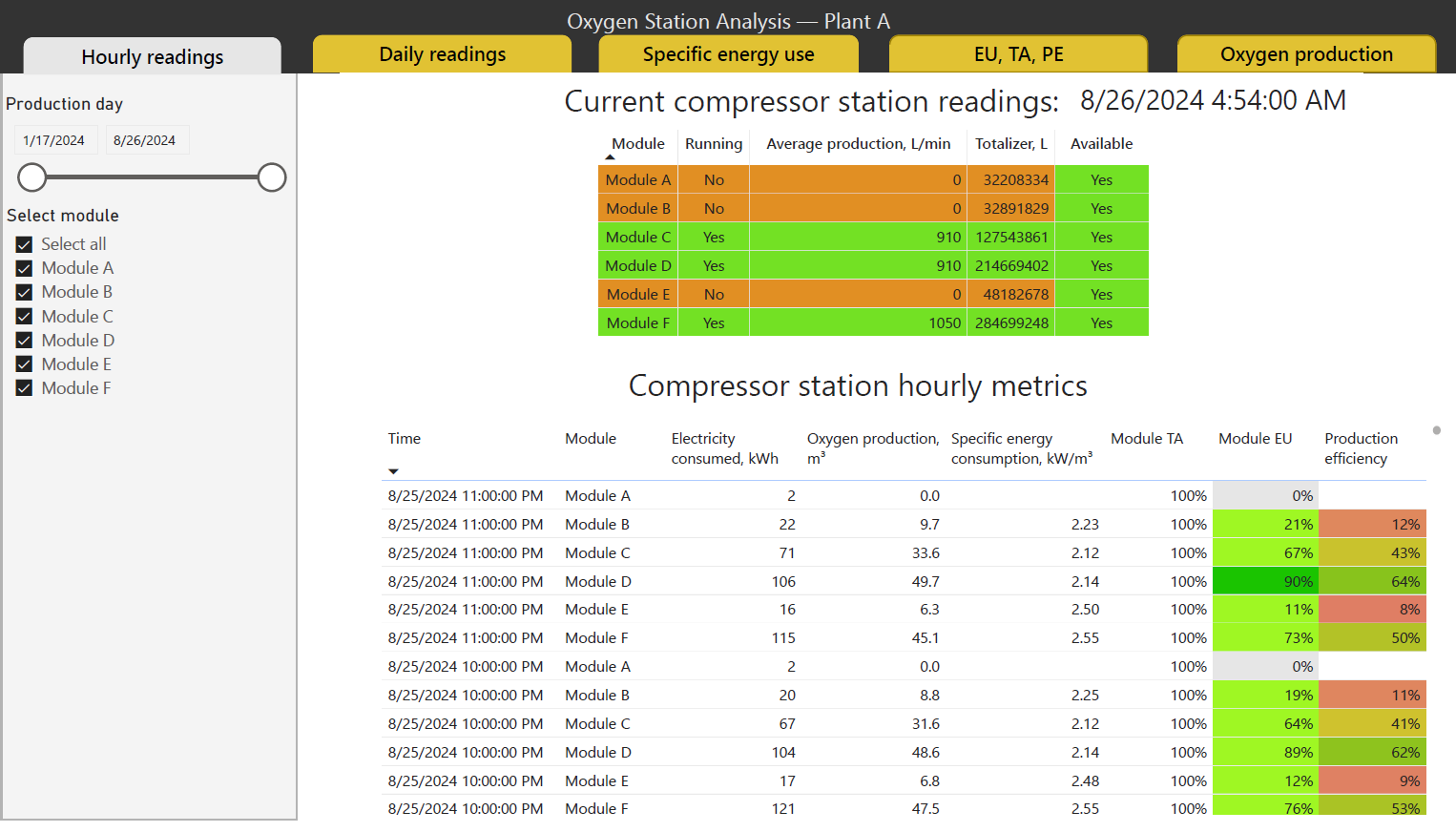
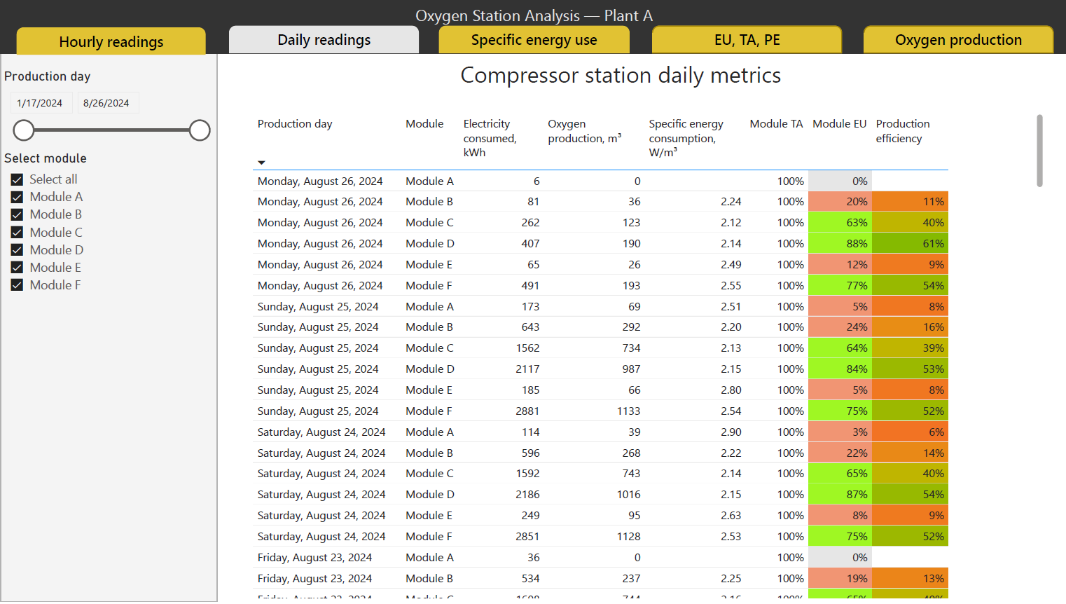
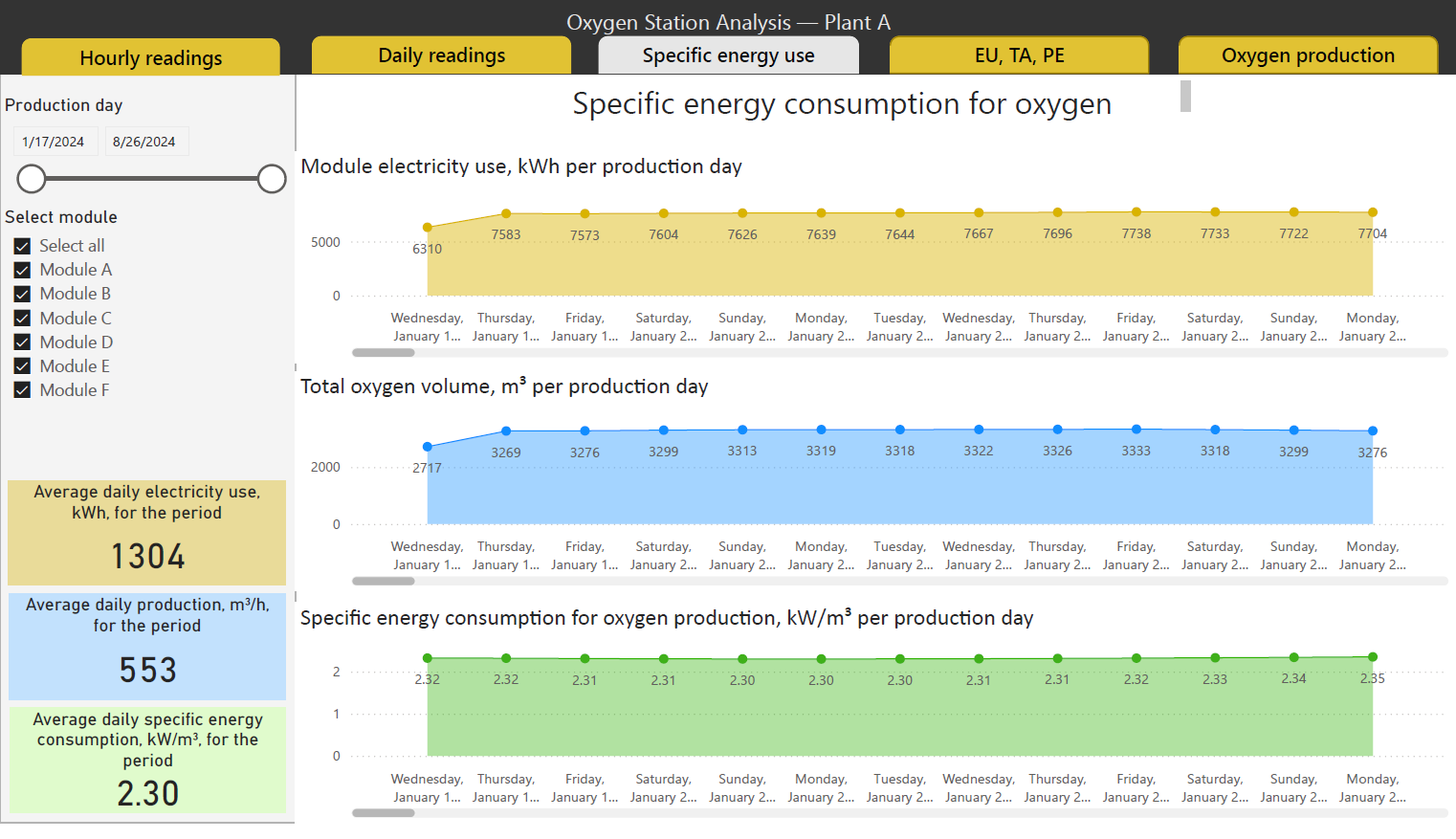
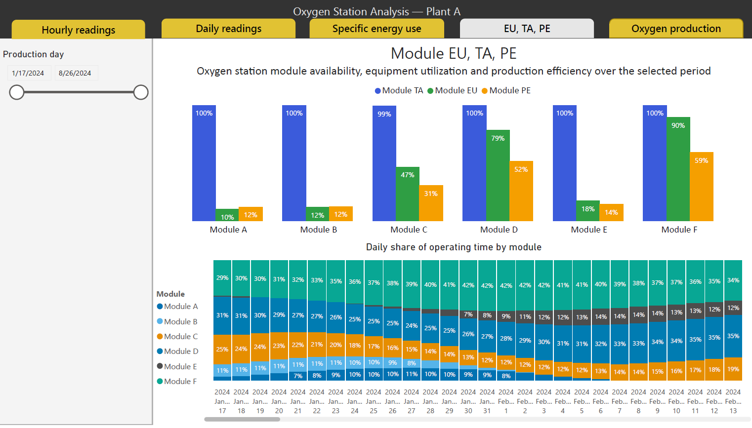
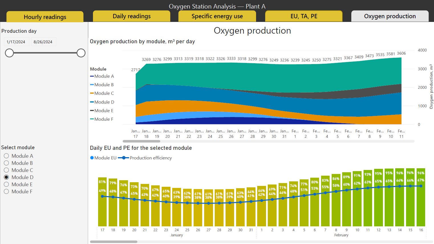
The five pages cover current operating status, hourly and daily readings, specific energy consumption, equipment performance and oxygen production.
Users can compare modules, select a reporting period and investigate changes in production or energy use. The report distinguishes between technical availability, equipment utilization and production efficiency, making it easier to understand the difference between equipment being ready, running and producing at its nominal rate.
The practical benefit
The report reduced the need to collect and combine readings by hand. Instead of relying on two daily snapshots, users could follow operating trends and examine individual modules when something needed attention.
The screenshots below use synthetic data and anonymized identifiers. The original dashboard design and calculation logic have been retained.