
Why Data Visualization Matters
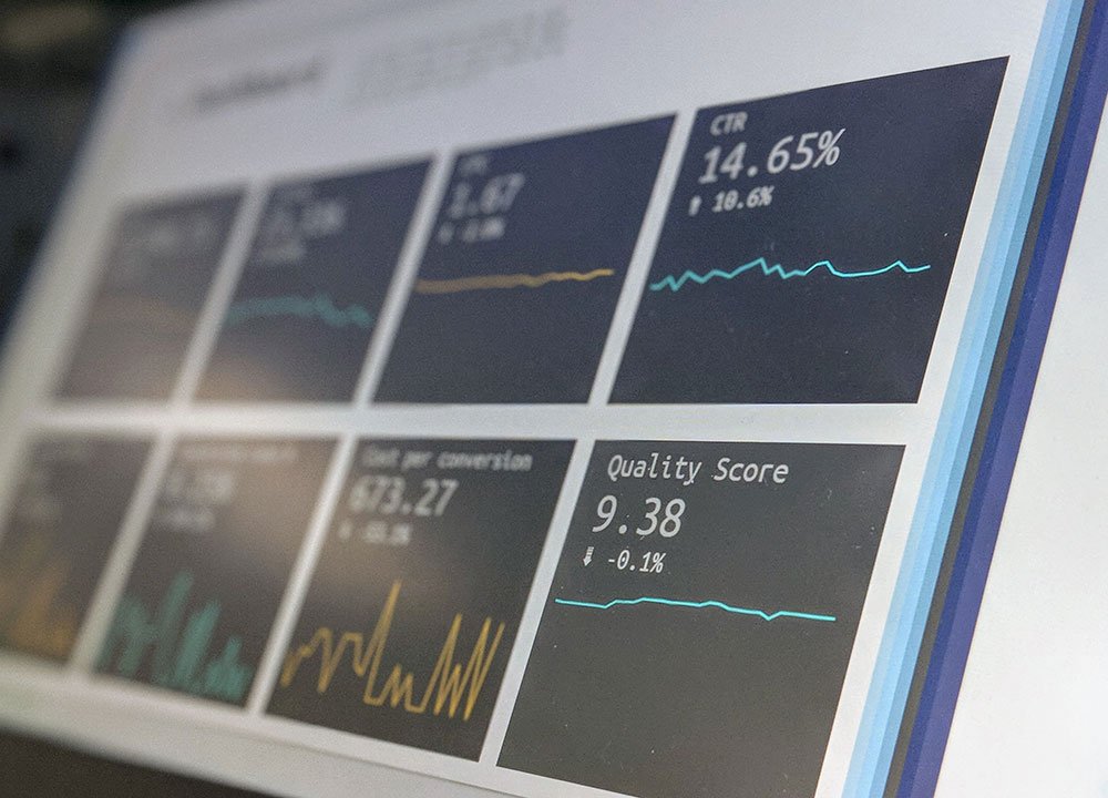
Data is everywhere, but raw data alone rarely provides value. Tables with thousands of rows, complex calculations, and large datasets may contain important information, yet patterns and problems can remain hidden.
Data visualization turns data into something people can quickly understand and use.
From Data to Insight
Imagine looking at a table containing daily sales figures for several years. It may be difficult to identify seasonality, unusual drops, or long-term growth just by reading the numbers.
Put the same information on a line chart, and the overall trend becomes visible almost immediately.
Visualization helps reveal:
- Trends and changes over time
- Unusual values and anomalies
- Relationships between variables
- Differences between categories
- Progress toward targets and KPIs
This is why charts and dashboards are often much more useful to decision-makers than raw datasets or long reports.
Faster Decision-Making
Managers usually do not need to examine every individual record behind a metric. They need to understand what is happening, why it is happening, and whether action is required.
A well-designed dashboard can answer these questions within seconds.
Instead of showing hundreds of production measurements, for example, a dashboard can highlight whether a KPI is within its target range, how it has changed over time, and which processes are responsible for the largest deviations.
The goal is not to show as much data as possible. The goal is to show the right information at the right level of detail.
Finding Patterns That Are Easy to Miss
The human brain is much better at recognizing visual patterns than interpreting large collections of numbers.
A scatter plot may reveal a relationship between two variables. A line chart may expose a recurring seasonal pattern. A bar chart can immediately show which category contributes most to a result.
Visualization is therefore useful not only for presenting completed analysis, but also during the analytical process itself.
Analysts often visualize data to understand distributions, detect outliers, compare groups, and test assumptions before building a final dashboard.
Good Visualization Is More Than a Beautiful Chart
An attractive dashboard is not necessarily a useful dashboard.
Effective data visualization requires choosing the correct chart, keeping the design clear, providing appropriate context, and focusing attention on the information that matters.
Every visual element should have a purpose
Colors, labels, scales, filters, and chart types should help the user understand the data rather than distract from it.
A line chart is usually more appropriate for displaying a trend over time, while a bar chart is better for comparing categories. KPI cards can summarize important indicators, while detailed charts allow users to investigate the reasons behind those numbers.
Dashboards as a Communication Tool
One of the most important skills of a data analyst is the ability to communicate findings to people who may not have a technical background.
A SQL query, Python script, or statistical model may produce the answer, but stakeholders still need to understand what that answer means for the business.
Tools such as Power BI, Tableau, Python, and Excel allow analysts to transform analytical results into interactive reports that connect technical analysis with business decisions.
A good dashboard tells a story: what happened, where the problem or opportunity is, and what deserves attention next.
Conclusion
Data visualization bridges the gap between data and decision-making.
Its real value is not in creating impressive charts. It is in making complex information easier to understand, helping people identify important patterns, and enabling faster, evidence-based decisions.
For a data analyst, the ability to query and analyze data is essential. But the ability to communicate the result clearly through visualization is what turns analysis into actionable insight.